

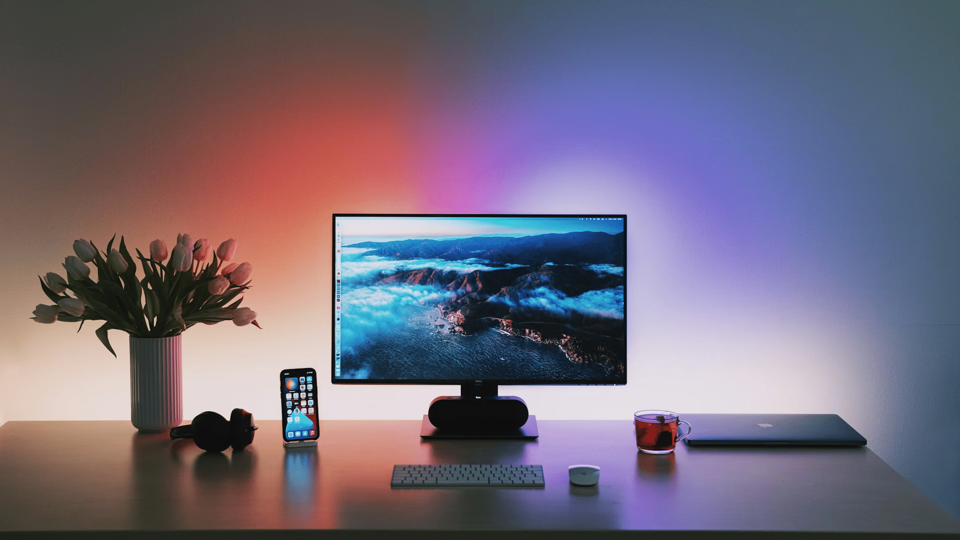
A “markets at a glance” setup sounds fancy, but the real goal is simple: fewer tabs, fewer distractions, and faster context when a decision needs to happen. In an office, especially one that touches budgets, procurement, sales planning, or reporting, the best widgets are the ones that answer small questions instantly, without pulling attention into a full trading terminal.
A clean dashboard can even borrow ideas from “quick-pick” interfaces people already understand, including the way slots present clear, bite-sized choices and immediate feedback. The point is not the theme, but the behavior: one glance, one meaning, no guessing. That same clarity is what separates a useful market widget from a screen that just looks “financial.”
The Rule Of One Glance: What A Widget Must Deliver
A widget earns its place on a desktop only if it compresses a real workflow. If a number is checked five times a day, it belongs in a widget. If it is checked once a month, it probably belongs in a report, not on the wall screen.
Good widgets also behave consistently. Colors mean the same thing every time. Time ranges don’t reset randomly. Labels stay stable. In an office setting, “pretty” is not the win. Predictable is the win.
Widgets That Pull Their Weight
Most offices don’t need twenty charts. They need a small set of signals that reduce uncertainty. The most useful widgets tend to cluster around four needs: direction, volatility, exposure, and timing.
Widgets worth keeping, even on a crowded desktop:
- Major Index Ticker Tape: S&P 500, Nasdaq, Dow, plus a local index if relevant. Simple up or down, plus percent change.
- FX Rates Panel: The few pairs that affect invoices and margins, not an endless currency zoo.
- Energy And Transport Snapshot: Oil, gas, and a quick freight proxy if logistics matter.
- Rates Corner: Key benchmark yields or central bank rate expectations, because borrowing costs leak into everything.
- Volatility Gauge: One clear measure of “market stress,” useful for timing announcements and purchases.
- Commodities Trio: The inputs tied to the business, like metals for manufacturing or grains for food-related operations.
This list looks basic, and that’s the point. A glance tool should be boringly reliable.
The Trap: Widgets That Look Smart But Waste Time
Some widgets are basically decorations with numbers. They demand interpretation, invite debate, and create noise. Those are fine for analysts who are actively researching, but not for a shared office dashboard meant to support quick decisions.
A common mistake is stacking too many correlated widgets. Five charts that all move together don’t add insight. They add anxiety. Another mistake is using “all markets” screens that update constantly and never answer a specific question.
How To Arrange The Dashboard So It Stays Useful
The layout matters more than most people admit. Even good widgets become useless if the eye has to hunt for them. A practical approach is to organize by decision speed: what needs an instant answer goes top-left, what supports context goes below, what is “nice to know” sits at the edge.
A simple layout that works in real offices:
- Top row: Today’s Direction
Index tape, key FX pair, one volatility gauge. - Middle row: Business Exposure
Two to four commodities or sector indicators that map to costs or revenue drivers. - Bottom row: Timing And Alerts
Economic calendar highlights, rate changes, and a small “what moved most” box. - Side strip: Watchlist
A short list of assets tied to projects, clients, or upcoming deals.
Notice what’s missing: giant candles, complex indicators, and charts that require explaining during every meeting.
Data Hygiene: The Unsexy Part That Saves Reputations
If a widget is wrong or stale, it becomes worse than useless. It builds false confidence. The best setups make the data source and timestamp obvious. If the time isn’t shown, the widget should not be trusted. A good “at a glance” board also needs consistent market hours logic, because after-hours moves can confuse teams who assume everything is live.
Tools that aggregate market data, including platforms like Barchart, are often used as reference views because they can reduce tab chaos. Still, any dashboard needs one internal rule: if a number can trigger action, the source and update timing must be clear.
Making It Office-Friendly: Calm Visuals, Clear Alerts
An office screen is not a personal trading rig. It should be readable from a distance, and it should not scream. Use fewer colors, bigger fonts, and limited motion. Alerts should be rare and meaningful, not constant. If everything is “urgent,” nothing is.
The future trend here is also obvious: more widget systems will become role-based. Finance sees rates and FX first. Operations sees energy and transport first. Sales sees sector and index mood first. Same markets, different priorities, less noise.
The Best Widget Is The One That Prevents A Meeting
A strong “markets at a glance” dashboard doesn’t try to predict the world. It reduces friction in small, daily moments. It gives direction quickly, flags risk early, and keeps attention from leaking into endless scrolling.
When the widgets are chosen with restraint and arranged with intent, the office gets something rare: calmer decisions made faster, with fewer accidental mistakes. That’s the whole game.
The post Markets At A Glance: The Desktop Widgets That Actually Help In A Busy Office first appeared on Africa Top Sports.